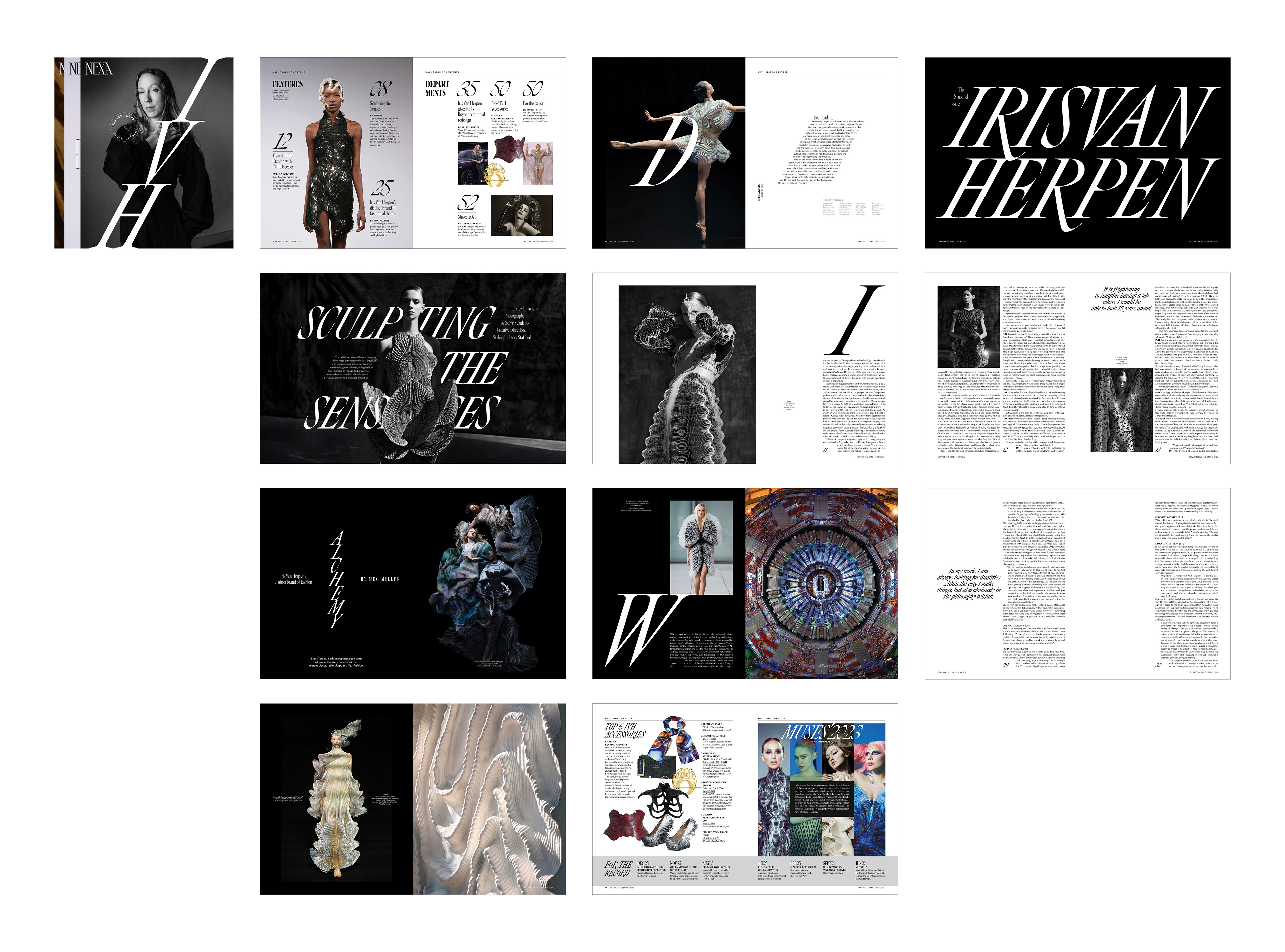
Nexa
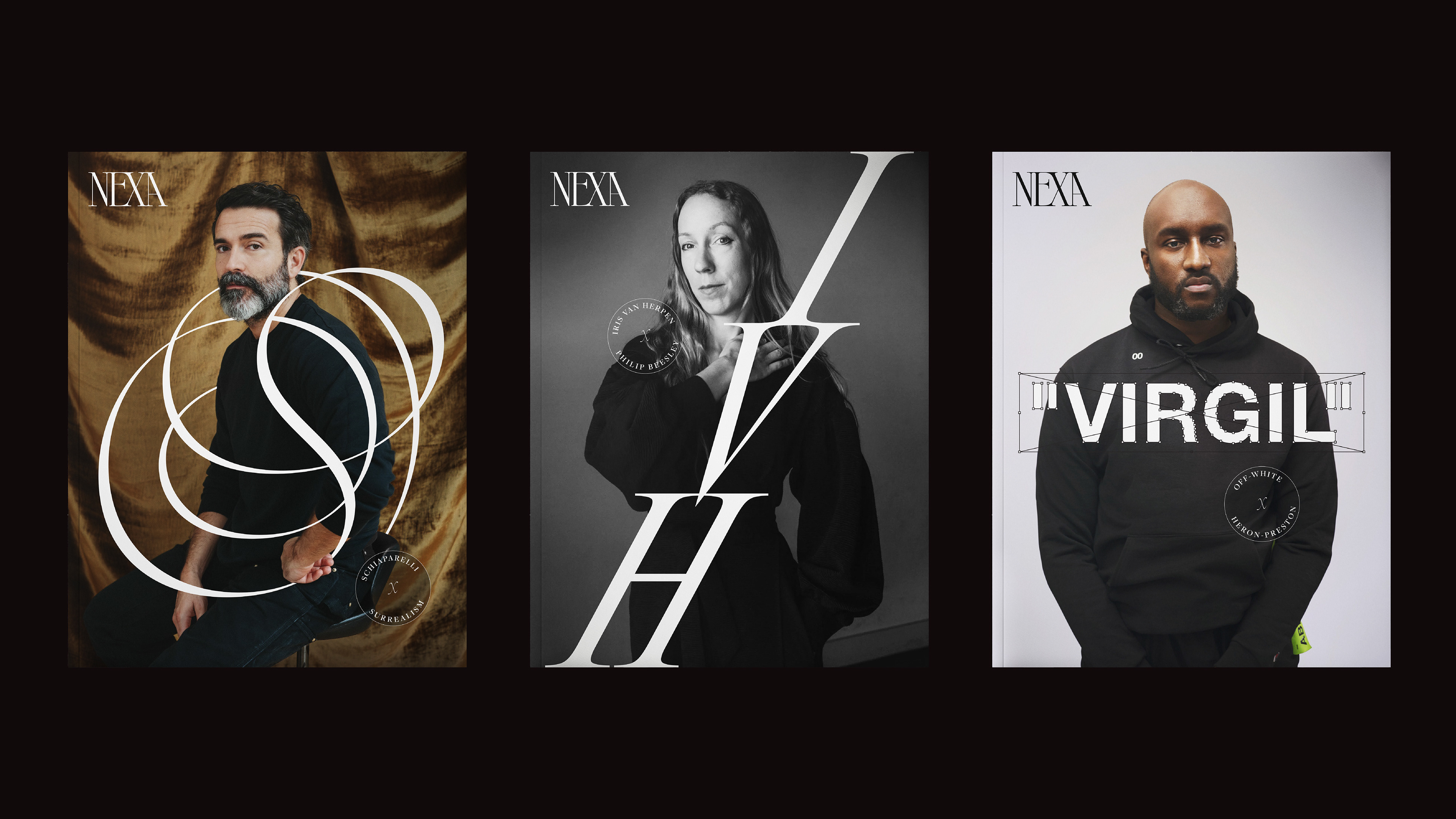
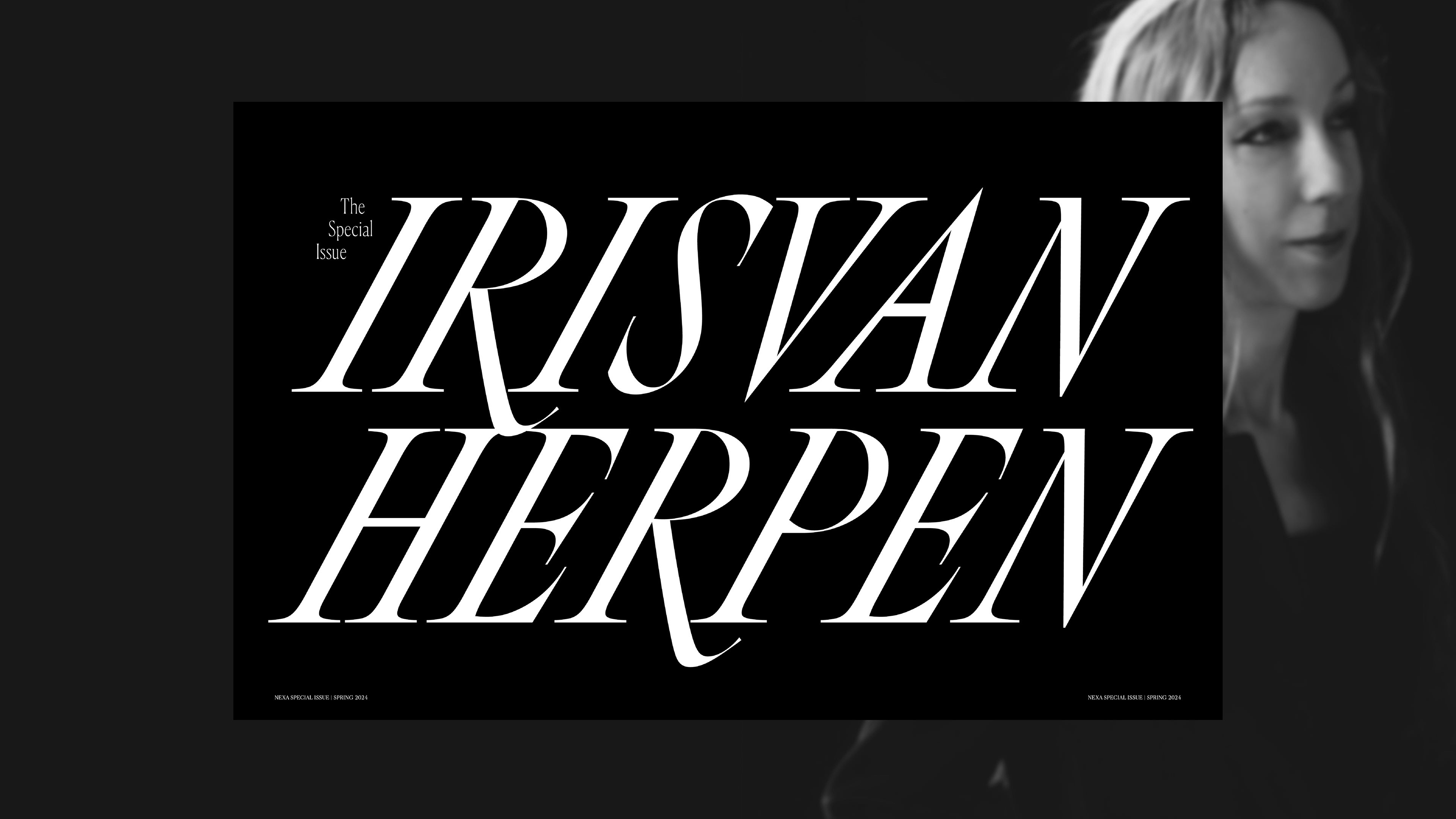
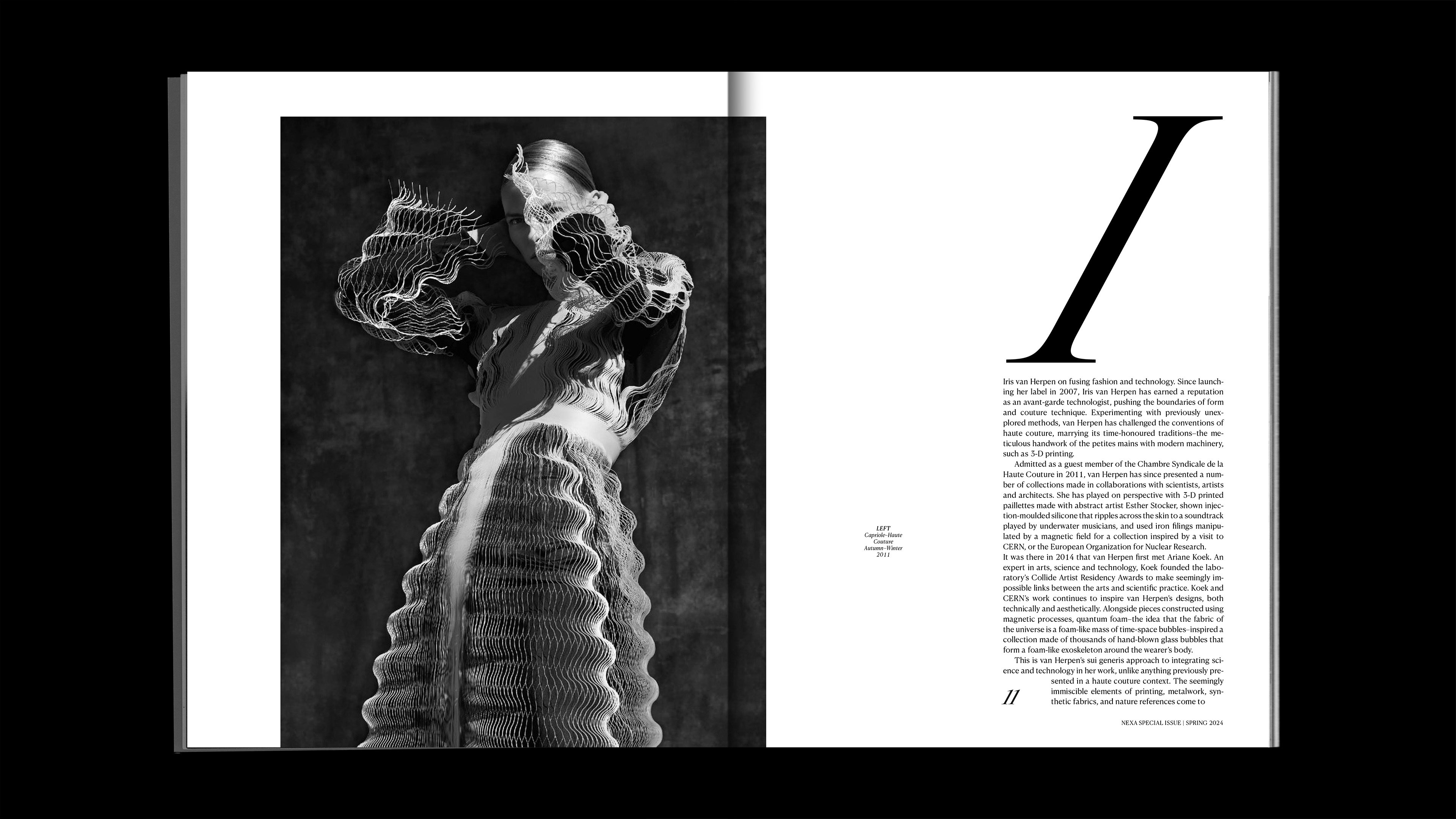
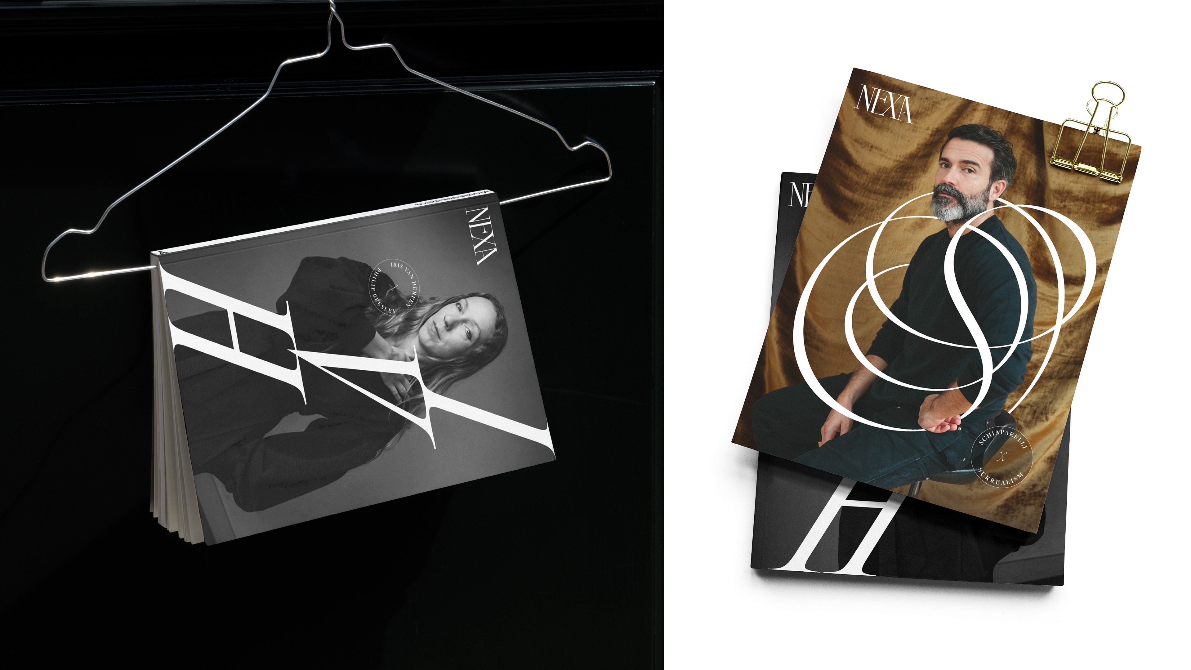
A fashion journal that documents the stories of designers, right from inspiration to process. It particularly focuses on the spirit of collaboration and camaraderie in the fashion industry. The following designs are an extension of a special issue investigating the creative genius of Dutch designer–Iris van Herpen, along with a peek into the visual system for Nexa through other hypothetical covers. The typographic treatment for the special issue is inspired from the off-key and futuristic nature of Van Herpen's designs.
MENTOR – Jeff Glendenning, Arsh Raziuddin
Recognized by STA 100, Indigo Design Awards Gold Winner, and AIGA Baltimore
MENTOR – Jeff Glendenning, Arsh Raziuddin
Recognized by STA 100, Indigo Design Awards Gold Winner, and AIGA Baltimore